top of page
about me!
Hilti North America
Year
Summer 2021 & Spring 2022
Team
Mentors: Gian Franco (Summer 2021), Collin Cragin (Spring 2022)
User interviews, information architecture, design system practices, usability testing, UI design
Skills
Role
I was a fully remote UX intern that spearheaded several projects to provide design consultation and research insights at a B2B global construction company.
👁 Overview
Navigating a UX internship in the construction industry
As the sole UX intern within the entire business unit of F&P Solutions at Hilti, I supported a variety of initiatives during both my Summer and Spring roles. This means I contributed to a series of assignments instead of a singular large-scale project, which I would typically expect of a tech-oriented program.
Although working within a non-traditional UX internship presented all sorts of challenges, I assisted in making product design decisions by working alongside designers and giving a fresh perspective on current internal and external-facing UX projects.
4 Projects, 4 Goals
To support the in-house UX team at the time, I operationalized on my own for all projects. Each of my solutions helped simplify the designers' duties, therefore increasing their efficiency in providing technology-leading products, services, and software into the construction industry.
Project #1
The Problem
There was no standardized method of document organization in SharePoint.
Some folders are empty and there are loose files in random places. This makes finding assets and onboarding new hires both very tedious processes, especially for product managers and other cross-functional designers.
This impacted all 4 UX segments within the business unit:
-
Hilti Construction Platform (HCP)
-
Mechanical +Electrical +Plumbing Solutions (MEP)
-
Structural Solutions
-
Commercial Solutions
The Solution
I created 2 site maps to demonstrate a redesigned file acquisition system. The type of framework that is implemented would use be dependent on the number of products the segment owns.
Research 🔍
Before building a solution, I needed to learn what exactly the products were. I personally was not familiar with any part of the construction industry, so I formulated a moderator script to help me discover the background information I lacked.
Through Zoom interviews, I conducted short interviews with the lead UX Designer of each of the 4 segments. In each session, I had them share their screen of their respective Sharepoint pages as I asked the following questions to guide the discussion:
-
"What is the goal of your product?
-
"How many products are you responsible for?"
-
"What are the different features of each product?"
-
"Who exactly is using the product(s) you design? What would they use them for?"
-
"Starting from the home screen of your repository, please walk me through the content of each file."
Analysis 🧠
After I completed the interviews, I had pivotal discoveries regarding the asset names.
Assumption #1
Each segment is named after and dedicated to a single product.
Sometimes the segment name is the product itself, but other times it acts as a category of various products.
💡
Assumption #2
All products are essentially different cogs that work together to run the same "machine".
💡
Not all products are related to each other because they are not all provided on the same platforms.
Assumption #3
All assets in a segment are organized strictly by their file type.
💡
Assets should be grouped by file type, but within a specified topic. That way, it will be easier to locate all related documents in a single place.
Defining the criterion
From here, I considered the user flow of how someone would want to find information in a segment's repository.

Clearly-labeled folders for assets
I determined that every segment will always contain the same 5 types of asset folders:
-
User Research
-
Notes
-
Prototypes
-
Design files
-
Archive


Therefore, I concluded that file organization would generally look like either of the following:
Deliverables 📦
I identified the existing files in each segment and created diagrams to show where they would be re-organized depending on its new framework.
Segment 1: HCP
HCP is a single product, and HCP 2 is a project focused on crating an upgraded second version of the software.
New File Structure
Original File Structure


Segment 2: MEP Solutions
MEP had a total of 3 products or "solutions" in the repository, which are the BIM CAD Library, FixPoint Calculator, and PROFIS MSE software. But due to many un-updated and missing assets, there were no identifiable projects. Regardless, this framework could easily accommodate the addition of project folders as necessary.
Original File Structure

New File Structure

Segment 3: Structural Solutions
Structural Solutions covers 4 products, which are Concrete to Concrete, Decking DP, PE Homepage, and Anchoring to Concrete services.
Original File Structure

New File Structure

In this segment, the following products were Commercial Services, On-Site Services (OSS), Selectors, and Submittal Generator.
Segment 4: Commercial Solutions
Original File Structure

New File Structure

Project #2
The Problem
The Hilti Design System (HDS) was oversaturated with unnecessary UI components.
Most of these are variants that served little to no consistent purpose to be part of the official system, causing designers to waste time filtering through it.
The Solution
I identified the most essential components to serve as the foundation of all Hilti UX materials. This maximized the efficiency of the HDS and allowed designers to determine similar uses and patterns between components, ultimately reducing redundancy in Hilti UI designs.
Research 🔍
To determine the core components, I cross-referenced HDS with the Material Design method. The Material Components are considered the interactive “building blocks” for creating a user interface:


Analysis 🧠
I conducted an audit of the HCP software to track the top 3 most common components used on the interface, which I discovered were the following:
-
Tabs
-
Combo Box Menus
-
Checkboxes
Simultaneously, I combed through the existing components in HDS and recorded my observations. From there, I concluded that most components could either be combined or simplified:
-
Buttons don't need multiple kinds of colors
-
The 3 most essential colors must indicate Default, Hover, Clicked, and Disabled states.
-
-
Snackbar components don't need to be gateway interactions
-
They are non-disruptive and will disappear from the interface on their own
-
Dialog Boxes already prompt users to complete actions
-
-
The Image List component only needs 1 style of displaying elements onscreen

Deliverables 📦
In the end, I narrowed down 40 elements to 14 fundamental components.
Project #3
The Problem
Certain products in the Commercial Solutions segment needed improved user interfaces.
Select product interfaces needed to be redesigned before being re-implemented in the software.
The Solution
For the last project of my summer internship, I built the mockups for the Submittal Generator's Cover Page and Submittal Documents pages. These were handed off to the Lead UX Designer assigned to the segment to propose my recommended UIs.
Research 🔍
Using a few of Jakob Nielsen's 10 Usability Heuristics, I noted the following characteristics of both the original layouts:
-
Poor visual hierarchy
-
The navigation tabs indicating what page the user is on is hard to find
-
-
Hard to scan
-
The user is forced to look back and forth across the page; there content is too "wide-set"
-
-
Visually unappealing
-
No indicators of the user's progress or location
Prototype ⚙️
Original Cover Page

New Cover Page
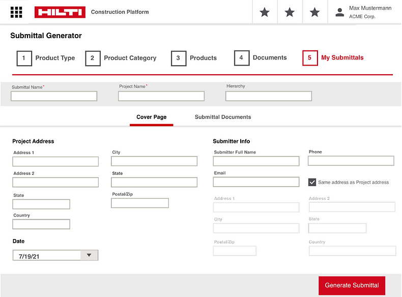
Revisions to Cover Page
-
Increased visibility of system status
-
Included a progress bar to indicate what stage of the feature the user is on
-
Centered the navigation tab and bolded text so users instantly know what page they're on
-
-
Increased flexibility and ease of use
-
Included a checkbox under "Submitter Info" so users can quickly pre-fill the address if it is the same as "Project Address".
-
-
Adjusted formatting
-
Used column formatting to center content and increase scannability
-
Old Submittal Documents Page

New Submittal Documents Page

Revisions to Submittal Documents Page
-
Utilized minimalist design
-
Replaced "Upload Custom Document" hyperlink with a button
-
Used cards to group content
-
Added collapsible features to show and hide information as needed
-
-
Project #4
*** Unfortunately, I cannot publicly share the design concept I tested since this was implemented into a private Hilti subscription-based feature.***
The Problem
A new design variation of the PROFIS Engineering Anchor Plate Design software needed to be tested.
The Solution
For the spring portion of my internship, I established the necessary criteria to conduct and facilitate 7 A/B tests and user interviews with internal stakeholders.
Below is this original interface that was compared to the new design concept.
💬 Reflection
Understanding the interdisciplinary crossroads of UX
During my time at Hilti, I learned how UX can fit into the bigger context of any company. It is important to maintain and improve all sorts of user experiences within a business, including internal systems and processes and the customer experience with their products (regardless if they are digital or not).
Taking ownership of projects in ambiguous and fast-paced work environment helped me gain industry experience and professional growth!
UX maturity varies in different industries
At the same time, I was exposed to different kinds of challenges that UX professionals may face when working in a non-tech industry. I saw instances of pushback from stakeholders when presented certain UX research and design recommendations (and vice versa), and observed the kinds of language and skills needed to resolve such
conflict to reach an alignment in business goals.
Shoutout to Hilti for giving me a one-of-a-kind internship experience! 😊
bottom of page