about me!
Honeywell: Performance+
Improving KPI discoverability on a dashboard for warehouse productivity
Duration
12 weeks
May - August 2023
Team
Xinke Wu (UX Design Intern), Tree Kraj (Sr. UX Researcher), Rob Jones (UX Designer)
Tools
UserTesting.com, Figma, Dovetail, Miro, Confluence
My Role
For this project, I worked as the sole UX Researcher, leading formative and generative research to further develop Honeywell's persona database by gathering insights specifically on the Area Supervisor role. This qualitative data informed the recommended design improvements to the Performance+ tool.
Due to the internship NDA, I've redacted sensitive information in the following artifacts.
👁 Project Overview
Performance+ (also known as P+) is a performance management software suite for warehouses/distribution center operations. I focused on specifically the shipping dashboard in P+, which relates to asset performance (ex: conveyor belt systems) in highly-automated warehouses.
Also, before this project, there was no persona-related data on Area Supervisors. This research was part of a larger project to best customize the entire P+ shipping dashboard view depending on the types of user and their needs.
Problem Statement
There is a surplus of unorganized data visualizations and Key Performance Indicators (KPIs) on the P+ shipping dashboard, making it difficult for warehouse employees to effectively search and act on data relevant to their role.

Solution
Redesign the dashboard interface to reflect the goals and mental models of Area Supervisors, optimizing their daily productivity in managing shipping-related data.
My Results
-
Research Deliverables: User Persona, Research Plan, Service Design Blueprint, Custom Research Activity
-
Qualitative insights informed design improvements on 4 widgets in the P+ dashboard
✏️ Work
For this 12-week project, I worked alongside a UX Design Intern who incorporated my research insights into the shipping dashboard redesigns. We followed the double diamond framework to organize our workload. My research aimed to uncover:
-
The most common operational problems that Area Supervisors face on the job
-
The kinds of information they look for to solve said problems
-
How they define success in their role, and what their daily touch points are that help them reach it

I outlined my research plan into a 3 phase strategy:
-
Phase 1: Generative Research
-
Who are Area Supervisors?
-
-
Phase 2: Formative Research
-
How would they use Performance+?
-
-
Phase 3: Concept Testing
-
Are our designs relevant and intuitive to them?
-

Background Research
Given the large scope of the project, I had to first ensure that the design intern and I had a strong understanding of the basic context that Performance+ is used in. From internal company resource hubs, I made sure we learned about:
- How warehouses operate
- The other roles that would also use P+
- What the existing P+ interface looks like
- All the KPI terms and data visualizations displayed in P+
Survey & Screener Design
Afterwards, I designed a survey to collect information that helped me create a user persona for Area Supervisors. Due to potential bias, none of my research participants could be existing P+ users. Instead, I recruited those with general mid-level experience via UserTesting. The screener also filtered for two other roles that Honeywell already had data on, solely to understand the relationship and differences between Operation Managers, Maintenance Managers, and Area Supervisors in a warehouse.
After gathering general insight on Area Supervisor priorities and pain points, I enlisted some of the more articulate respondents to participate in a user interview and activity.


User Interviews
Over the course of 1 week, I conducted 6 user interview and research activity sessions through Zoom on UserTesting. This phase of formative research revealed what specific KPIs they look at to solve shipping and asset problems. Each session was 1 hour long:
-
Introduction: 5 minutes
-
Interview Questions (7): 20 minutes
-
Activity: 35 minutes
-
Closing Thoughts /Questions: 5 minutes
The interview portion prepared each Area Supervisor for the following activity, which had them think critically about their personal work routine and motivations. Their responses provided a chronological order of daily responsibilities, tools, and touch points that I mapped out in a service design blueprint.
Custom UX Research Activity
For the second half of the session, I had designed and deployed my own research activity, which I moderated via Figjam. I made this activity a blend of various storytelling methodologies, because I needed an in-depth understanding of:
-
The most important KPIs to Area Supervisors (depending on the event or problem at hand)
-
Any unique terminologies they may use to refer to KPIs that are labeled differently in P+
-
Which KPIs are dependent on each other to reveal certain data
-
How KPI data is communicated visually in their current software
The activity is a mix of the following methods:
-
Moderated Card sorting
-
Scenario-and-Task framework
-
Think-Aloud method
I split the activity into 3 tasks:
-
Make a sticky note for each problem they've faced relating to shipping or assets in their warehouse
2. Identify which of the provided KPIs that they use to solve then, then drag the cards into the green square and explain why
3. For each of their selected KPI cards, they choose a data visualization that they think would be the most helpful/intuitive


🔎 Insights
What We Learned About Area Supervisors and Their Prioritized KPIs
01
They need different levels of visibility on data to make it easier and faster to interpret.
Area Supervisors are concerned with specific details to fix issues as they happen on-site, but may need to communicate general trends to higher-ups to support overall warehouse productivity.
02
Their preferred data visualizations depend on the number of variables they're observing.
The type of graph and its filtering options depends depends on the size of their warehouse and the number of assets.
03
Data visualizations need to include clear indicators for abnormal data points
To help users quickly recognize and address urgent events, graphs should have some sort of interactive icon that can provide deeper insight on the data.


💥 Impact
Co-Designing & Concept Testing
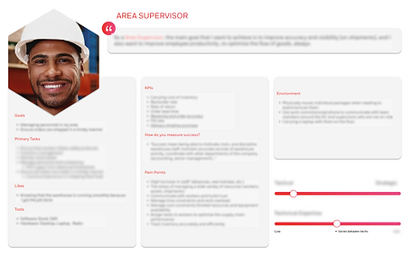
Before the UX Design intern finalized the prototype for me to lead concept testing with, I helped her sketch different interface layouts for the 4 widgets she was redesigning. One of my mockups was incorporated into the final concept, which focused on Insight #1 and #2 (using different data visualizations for different scales of data).
Specifically, I organized the data types based on how detailed they are - "tactical" KPIs were more granular in measurements (such as timeframes, types and amount of errors, etc.) and "strategic" KPIs gave a more broad overview over a wider range of time for trends.


Other things I did...
-
The Area Supervisor user persona and service design blueprint was added to Honeywell's Dovetail Research Repository, ultimately filling the knowledge gap on Area Supervisors.
-
The readout was recorded and the deck was shared with Honeywell's international UX Design teams based in North Carolina, Bengaluru, and Israel, influencing global strategy planning for Performance+.
🙇🏽♀️ Reflection
This was one of the most fun and engaging UX Research internship I've ever had! It was my first time to relocate across the country for an internship (being that most of my work experiences were remote due to COVID-19 in recent years), and working at the Atlanta headquarters for 3 months with the Honeywell Connected Enterprise team was an incredibly eye-opening experience.
Here are some of my personal big takeaways from this experience:
⏱ Demonstrate seamless adaptability to shortened and moving project timelines, which were due to participant recruitment-related challenges.
🤝🏽 Being able to contribute my own design ideas by workshopping with my UX Design partner to ensure research insights are reflected accurately and effectively in the final prototypes.
🤔 Navigate and resolve challenging conversations with stakeholders to clearly define the scope to a complex project.
💡 Exercise full creative agency in my research approach by building my own UX activity from scratch.
🛠️ Learning how to use industry-level research and participant management tools.
My time with HCE taught me the significance of flexibility, empathy, and collaboration in UX research. It has increased my confidence and skillset of research tactics to apply to future projects, and provided me a highly-supportive team of professional UX mentors and manager who were gracious and constructive in their guidance.

