about me!
Salad and Go
Reimagining the app's food ordering experience through a new rewards program and modernized interface.
Year
Spring 2022
Team
Solo Project
Skills
Adobe XD, user research & synthesis, user experience strategy & user interface design
Role
For my senior capstone project, I conducted a heuristic evaluation, competitive analysis, usability tests, and iterated through designs to present a high-fidelity prototype of how the Salad and Go app can be improved to reflect current Quick Serve Restaurant (QSR) industry standards.

👁 Overview
What is Salad and Go?
It's a drive-thru food chain that sells salads and other healthy snacks throughout select locations in Arizona, Texas and Oklahoma.
The Problem
Many QSRs have their own apps to accommodate faster ordering, customer outreach, and customer retention. Salad and Go already has one, but compared to its competitors, it lacks an intuitive user flow, aesthetics, and incentives to encourage people to download and consistently use it.
The Outcome
I redesigned the app to feature improved usability, a modernized interface design, and a rewards program.
🔎 Research
Heuristic Evaluation
To find gaps in the app's existing user experience, I assessed it with Jakob Nielsen's 10 Usability Heuristics for User Interface Design. I wanted to get a base understanding of the current issues before testing with other users.
Click here to expand my heuristic evaluation documents!


User Testing
Next, I had 10 Arizona-based peers to navigate the current app to collect user insights and quotes. I wanted these tests to validate the findings in my Heuristic Analysis, as well as expose specific issues I might've overlooked in my personal evaluation.
Scenario & Tasks
"You love Salad and Go and are craving it for lunch. You don't want to get stuck in the drive-thru line but you've never placed an online pickup order there before."
1. Download the app
2. Set your pickup location
3. Place 1 order for any salad with 3 modifications
4. Go to the checkout page.
Below are screenshots from the current app, which are the 8 total pages that users had touch points on to complete the task.

1. Landing Page��

5. Sub-menu Food Page (Salads)

2. Location Finder

6. Food Customization

3. Start an Order

7. Order Items

4. Main Menu

8. Sign Up
Results
Many problems arose, but the most common issue was related to the app's usability.
Usability Issues
-
80% of users started the test by clicking the "Start Order Now" button on Page 1. It did not work immediately and took multiple taps to get to Page 2.
-
The other 20% tried the "Create an Account" button too, which worked instantly. The following are user quotes that reflected their experiences:
"I wouldn't have known that I needed to sign up just to pay ... if I didn't scroll down and see the label 'Sign up to order'. It was under the 'Create an Account' button."
"I feel like the 'Start Order Now' button implies that I don't need an account, but I was wrong."
"It doesn't help that the 'Start Order Now' button doesn't work the first few times I click it. I thought it was broken so I clicked the next button underneath it and that worked fine."
-
The other 80% realized they needed an account towards the end of their test when clicked the "Checkout" button on Page 7 and were sent to Page 8.
-
On Page 8, 20% of users thought they couldn't pay regardless if they had an account because they don't have ApplePay
Aesthetic Issues
-
30% of users felt the interface design looked "outdated" or "old"
Incentive Issues
-
Upon completing their tests, 100% of users felt that it was unnecessary and a hassle to make an account just to buy food and nothing else.
Competitive Analysis
I also wanted to learn what other QSR apps have in order to identify opportunities and trends that can be accounted for in the prototyping phase. I studied McDonald's, Starbucks, and Domino's because they are the top 3 most downloaded QSR apps of 2022.

🧠 Analyze
Journey Map
As a loyal Salad and Go customer, I had used the app once or twice myself. I mapped out my personal frustrations with the current user flow and compared which of my experiences intersected with the feedback from user testing.

Storyboard
Building off the journey map and the insights from the user tests, I dissected the flow of the worst-case scenario using the current app, as well as the best-case scenario using my idea of the improved version of the app. The storyboard was from the point of view of someone who eats at Salad and Go but has never used the app before.
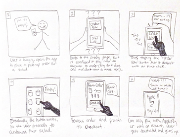
Worst-case scenario

Best-case scenario
Restructuring the Site Map
And finally, before jumping into prototyping, I took all the personal and external insights from my research to create a new information architecture structure to support my design decisions.
Especially referring to the Journey Map and Storyboards, I had to ensure that my redesigned version of the app was not only intuitive but could still be accessible to users even if they don't have the time/desire to gain incentives at the moment of purchase.
The new site map outlines the following:
-
Users can access the app by either signing up, logging in, or without an account
-
All users must specify a Salad & Go location before accessing the rest of the app
-
Users without an account can order food but will NOT have access to Daily Deals, Code, Rewards, and Profile pages
-
If user tries to click these pages, they will be advised to create an account
-

Summary: Business Analysis of Insights
-
Users need a motive to create an account - if that's not clear, they won't make one
-
Even if there is a motive, users want the choice to opt in/out - avoid gatekeeping
-
At the end of the day, the main goal of the app is for people to order food - let them do that with or without an account
-
Sales will not be negatively impacted if users order on the app without an account
-
They are still buying, they just need an alternative method for the drive-thru
-
⚙️ Prototype
Prioritizing Screens
Out of the three issues concerning usability, aesthetics, and incentives in the current app, I decided to focus primarily on usability. Without a smooth and intuitive user flow, the user will not be able to focus on anything else. I restructured the way that users would navigate the app depending on their "member status".
-
Sign Up = New member
-
Log In = Returning member
-
No account = Non-member user
Usability Testing
Using my Adobe XD wireframes, I interviewed 5 people to complete tasks for 3 total scenarios. If successful, users will be able to understand what features they can and cannot access depending on if they have an account on the app.
Scenario & Tasks #1
"You want to get Salad and Go for lunch today, but you're really busy and don't want to be stuck in the drive-thru line."
1. Access the app without creating an account
2. Select a food time
3. Pay for your order


.png)


Scenario & Tasks #2
"You love Salad and Go and eat it everyday. You hear that there are exclusive deals if you download the app, and you want to take advantage of that."
1. Make an account
2. Select a daily deal
3. Pay for your order


%20%E2%80%93%201.png)
%20%E2%80%93%201.png)


Scenario & Tasks #3
"You have the Salad and Go app and use it every time you go to a drive-thru. You have a lot of points and want to redeem them for free food."
1. Login to your account
2. Select a reward item
3. Pay for your order

.png)


🧪 Test
Results
-
There was an issue with the circular image frames on the Menu and Rewards pages; some users did not know those were supposed to be pictures.
-
In Scenarios 2 & 3, the highest traffic was on the Home page on the Menu subpage.
-
Users thought the slider at the top was interactive, when it's only meant to visualize how many points they have.
-
-
The layout of the "Your Order" page confused some users, saying the "You Might Also Like..." section looked out of place
-
Some users did not understand that the star icon in the navigation bar indicated the Rewards page
More Revisions
After I built upon the wireframes with modifications suggested from the usability tests, my classmates gave the most feedback on the Order page and Rewards page.


🔨 Build
Brand color palette
In the finished deliverable, I made sure to use the same colors used on its original app and website. I identified the HEX codes by using a color picker tool.

High-fidelity prototypes
I also wanted to thoroughly demonstrate a reimagined interface design that still felt familiar to the Salad and Go brand, so I added a couple more screens to fill in the gaps and to further execute my solution. Check them out below!


